Roselle
July 16, 2026 • 5 min read
Roselle is a store dedicated to providing high-quality products for mothers, babies, and children. Whether it’s essential care items, clothing, or toys, Roselle stands as a nurturing and trusted brand for families. As a brand that blends care, elegance, and practicality, Roselle needed a logo that could embody these qualities while appealing to its core audience.
Core Values of Roselle:
- Nurturing: Creating a warm, welcoming experience for mothers and children.
- Elegance: Reflecting sophistication and beauty in every detail.
-Trustworthiness: Delivering reliable and high-quality products for families.
These values were central to the design process, ensuring the logo connects emotionally with Roselle's audience and establishes it as a standout in the family care market.
Design Concept:
- Symbolic Resonance: Represent the nurturing essence of motherhood and the beauty of nature.
- Modern Appeal: Be sleek and professional while maintaining warmth and approachability.
- Versatility: Adapt seamlessly across various mediums, from product packaging to digital platforms.
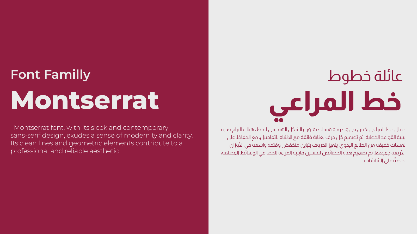
Typography:
- Montserrat: A clean, contemporary font for Latin characters that conveys professionalism and modernity.
- Almarai: A beautiful Arabic typeface that complements Roselle's elegance and accessibility.
The combination ensures inclusivity and cultural sensitivity while maintaining visual harmony.
Color Palette:
These hues align perfectly with Roselle’s mission to cater to mothers and children while projecting an aura of trust and quality.
[palette:#8B1D40,#421020,#161616,#000000,#E7E7E7,#A7A7A7]
Logo Design:
At the heart of the Roselle logo is a stylized “R” intertwined with a delicate flower. This fusion represents the brand’s connection to growth, care, and the beauty of nurturing life.
- Flower Element: A timeless symbol of growth, love, and family.
- R Integration: Makes the logo recognizable, tying it uniquely to Roselle.
- Minimalistic Design: Clean lines ensure scalability and versatility across platforms.
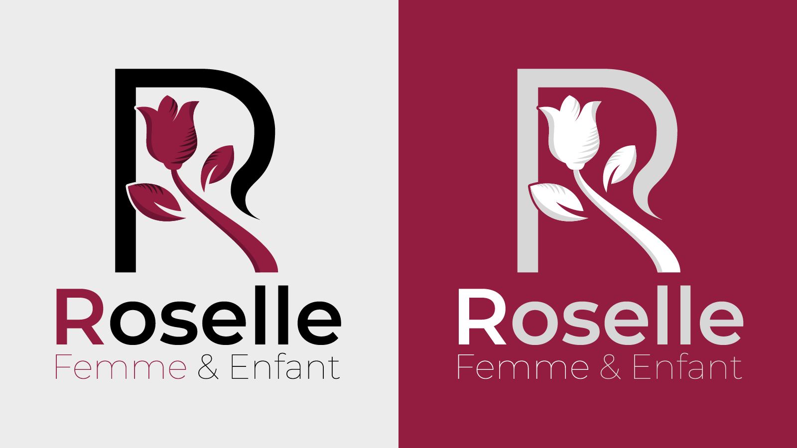
Logo Applications:
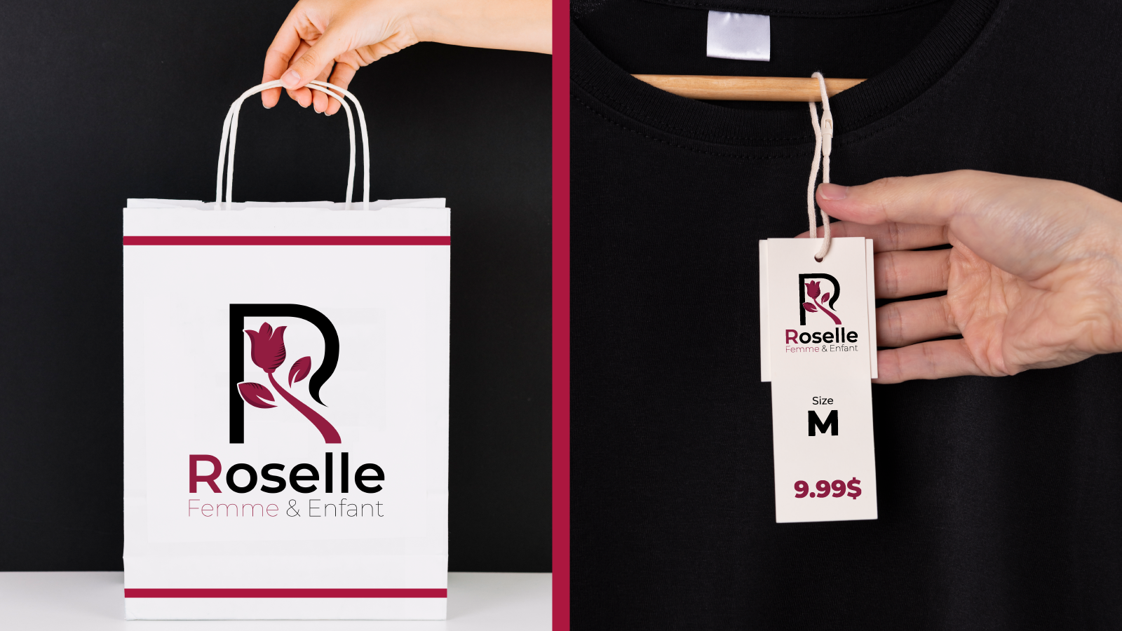
On Packaging:
The logo is designed to look elegant and inviting on product packaging, enhancing the customer’s unboxing experience.
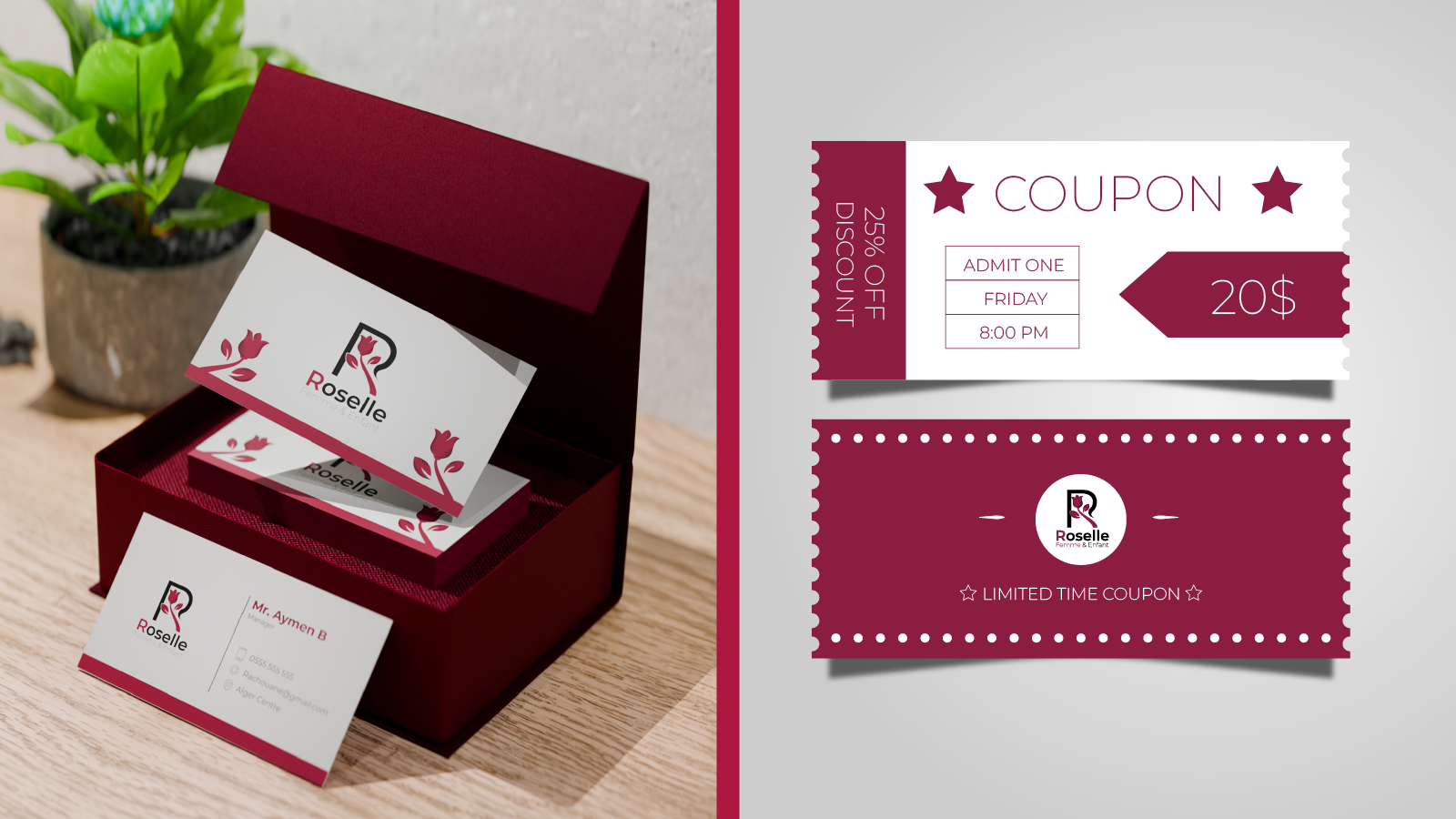
In Marketing:
Whether on banners, flyers, or social media posts, the logo communicates trust and care while being visually appealing.
Design Value:
The Roselle logo is more than a decorative element—it’s a reflection of the brand’s values and mission.
- Emotional Connection: The floral element connects with mothers and families on a sentimental level.
- Brand Recognition: The elegant and memorable design makes Roselle stand out in a competitive market.
- Professional Appeal: The balanced typography and color palette build trust and credibility.
Team Feedback:
Working closely with the Roselle team, we ensured the logo aligned perfectly with their vision. Here’s what they said:
The logo captures everything Roselle represents—love, care, and elegance. It’s beautiful, professional, and truly speaks to our audience.
The Roselle logo is a cornerstone of its brand identity, encapsulating its dedication to mothers, babies, and children. With its thoughtful design, versatile typography, and meaningful symbolism, the logo sets the stage for Roselle to flourish as a trusted name in family care.